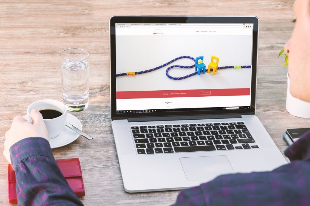
 Make sure that your homepage is meant to impress your target audience so they’ll be more compelled to engage with your site. Below are ways that can do this.
1. Primary Call to Action
When you create your website, you want to make sure that your visitors will stay for as long as possible. In doing so, you must create call-to-action buttons that direct them deeper into your site.
The designs of call-to-action buttons should be strong and hard to ignore. Its colors are one of its selling factor – use one that is in contrast to the color theme of your homepage but still matches your homepage’s overall design.
Ideally, copies should be brief and action-oriented. Make sure to place them where visitors can easily spot them, keeping in mind that they shouldn’t look out of place and desperate for attention.
2. Social Proof
Gaining your visitors’ trust is one step forward to their buying decision cycle. Badges, certifications, and ratings are just some of the proven social proof that successful bloggers have always used.
Slapping in positive testimonials from your past clients is an effective persuasion tool that also adds up to your credibility. Make these testimonials believable by adding their name along with their high-quality photo.
Moreover, testimonials work because people tend to use services that they know others have already used. When done wrong, it could be a reason for the decline of your conversion rates.
3. Content Offer
Folks don’t just fill out forms freely without expecting something in return. Offering them free guides, trials, slideshows, coupons, or case studies in exchange of their information is an instant lead magnet.
Though, this could be a hit or a miss. Content offers are expected to be premium and highly valuable to your target market. Otherwise, you could be losing your leads and hurting your business progress.Also, keep in mind that great offers should always complement your products and services. After all, sales and conversions will always be your highest priority.
4. Success Indicators
Bragging your awards, nominations, and other recognitions are an instant plus points for a good first impression. Similar to social proof, it also adds credibility to people who visit your website for the first time.
Hard earned awards are victories that should always be showcased. It also speaks that you are not just all talk, your works are recognized by other organizations too!
5. Beautiful Design
The visual appeal of your homepage should leave a good lasting impression to anyone who visits your site. According to Campaign Monitor, a good design should motivate a person to take action and provide an easy path to conversion.
The theme and design must also fit your business industry. Does it fit a parallax scrolling style, a grid, or a full-width imagery design? Either way, prioritize the fact that your homepage is for your customers, not for you. Invest an effort in making it easy for them to explore your site by eliminating distractions and presenting your business with style!
Conclusion
Your homepage is one of the most important parts of your site. It is where the vast majority of traffic goes directly to and is where you must show off everything that’s best about you – and best you can offer them. Having said that, it should be designed as such that it caters different audiences but still having a purpose of converting said traffic to leads and long-term customers.
Originally posted on July 10, 2017 @ 9:58 am